Microblog
An experiment where, for almost a full year, I published micro posts directly on the site. Here are all of them in reverse chronological order.
Speaking of Safari, I actually ended up restoring compact tabs since I prefer them over the old design. My only qualm with Safari during the beta was the adaptive toolbar color but that’s gone now.
As a heavy Safari and Notes user, Tab Groups and Quick Notes in Monterey have been a great boon for my productivity. And for all the Twitter drama the Safari 15 redesign generated, it’s been a solid release for me so far.
This weekend I hesitantly started migrating my 11k LOC server-side Swift project to use async/await, and I’ve been
having a blast. I still have ways to go, but the code is easier to read and
reason about, which conveniently highlights areas that can be refactored out to
streamline the codebase even further.
I really want to keep liking Gatsby.js, but the distasteful npm ecosystem, the forced client-side JavaScript, and my complete lack of use for client-side hydration—the process of turning static pages into interactive ones using JS—have been standing in the way as of late.
Javier once again knocks it out of the park with a meticulously curated list of questions and answers from this WWDC’s SwiftUI digital lounge.
This easter break I built my first command line utility in Swift using the Argument Parser library. My main motivation was to automate some of the tasks I have been doing manually in one of my unannounced projects. The result is a kickass CLI with all the bells and whistles such as help, auto-completion, etc. Shoutout to Nate Cook over at Apple for this awesome library!
風任せ (かぜまかせ - kaze-makase)
- Literal meaning: leaving it to the wind.
- Figurative meaning: being worry-free, going with the flow, leaving things to the course of events.
- Example: 船は帆任せ、帆は風任せ
Open-source maintainers: README files should not replace proper reference documentation.
I noticed that I consistently, and mistakenly, name the first closure parameter in Swift functions with multiple trailing closures. My two cents on SE-297 now that the dust has settled: ignoring this specific feedback point was not a programmer-centric decision.
“No one gives a shit what programming language you use.” A harsh but forthright rant by George Stocker.
There’s nothing wrong with preferring one language over another, as long as it is not the only deciding factor. I was tempted to use Swift for building static sites, but I decided against that because JavaScript and its ecosystem, warts and all, is still better suited for Web development.
I love the indie Web concept of POSSE, but it’s
not universally practical given how the platform and the format actively shape
the content. Many of my micro-posts fit poorly in the context of
Twitter/Mastodon, which prompted me to come up with creative hacky
workarounds
to remedy that—entirely defeating the purpose of POSSE. Going forward, all
content posted here will be syndicated to a dedicated account,
@WideGamutFeed, leaving me the freedom to
retweet or quote tweet using the main account for additional context or
commentary.
With the Gatsby 3.0 migration complete, I took some time to try out Gatsby Cloud. The onboarding was smooth and the build times were almost twice as fast as what I saw on Netlify for the same build. I moved this site there already and will follow up with the others in the coming weeks.
Sylvain Kerkour writes about the high churn rate in the Rust language:
Unfortunately, there is one thing that makes me anxious about its future: the 6-week development cycles. It’s, I believe, one of the causes of an unhealthy problem: feature bloat. It’s also the cause, in my opinion, of another problem: the immaturity of the ecosystem.
I share some of these feelings with regards to Swift. On the flip side, seeing a language grow and evolve right before your eyes can be a unique educational experience. I genuinely can’t wait for the concurrency work to land and make all my code obsolete overnight.
Yesterday I started migrating this site to the freshly announced Gatsby
3.0, and to my delight, it was a much
smoother experience than I had anticipated. I had some issues with one
particular community
plugin,
but the fix didn’t take long to surface on GitHub. The changes are living on the
gatsby-3 branch
for now, but that shouldn’t remain the case once I am done migrating to the
new
gatsby-plugin-image.
Good to see both Rust and Kotlin move to a foundation-based governance model. I’m not holding my breath for Swift, but I think it’s an important step towards making it a truly general purpose language.
Today I open-sourced Kroma, a collection of color helpers for SwiftUI. While it’s not feature-complete, it might be already useful in a handful of situations, such as determining if a given color is perceived as light or dark. This will likely end up being split into 2 packages down the line as I add more framework-agnostic color manipulation and conversion helpers. In the meantime, give it a try and let me know what you think!
Santa came late this year, but he at least made it just in time for my birthday!
In preparation of the beta launch of one of my yet-to-be-announced projects, I have spent some time devising a plan for server-side caching using Redis. This led me to read about some common caching strategies such as cache-aside and write-through (link). I was never fluent in backend development jargon, but it’s never late to fix that!
Between Combine’s
Publisher, The Composable
Architecture’s
Effect, and NIO’s EventLoopFuture, I
am often left wondering what operations are available where and what they’re
called. Maybe I can use some type aliases and extensions to bridge the API gaps.
In software, there is room for specialists, generalists, and everything in between. Enough with gatekeeping already.
Loren Brichter (Twitter) shedding some light on yet another Chrome debacle on macOS:
Google Chrome installs something called Keystone on your computer, which nefariously hides itself from Activity Monitor and makes your whole computer slow even when Chrome isn’t running.
I still don’t understand how people choose to use a piece of software that has consistently abused their trust.
After 8 months of writing This Week I Learned, I would like to try out a more spaced out frequency starting this month. Beside alleviating some of the pressure, the increased gap between the learnings and the synthesis is likely to help me remember things for longer!
“Who’s the idiot who wrote this code?” Oh, never mind, it’s yours truly from a couple of weeks ago.
The “users won’t be able to tell the difference” argument for Electron apps falls apart like a house of cards after every major OS release. It’s a weak argument to begin with, but these transition periods widen the chasm between proper native apps and all the other junk.
I found a solution to the problem I posted about a while ago. It turns out that clearing input cache using these two commands takes care of restoring things to the way they’re supposed to be:
sudo rm /System/Library/Caches/com.apple.IntlDataCache*
sudo rm /var/folders/*/*/*/com.apple.IntlDataCache*
Now back to typing Japanese. やったー!
After updating my main partition to Big Sur, I noticed that my Japanese keyboard input sources entirely disappeared, from both the switcher and System Preferences. Anyone else came across this bug?
To say that my study and work experience in the US shaped the person I am today would be an understatement. I purposefully stay clear of discussing politics with strangers, especially online, but it warms my heart to see that love and compassion prevailed this week. Onwards and upwards.
You know your investment in good app architecture is paying off when you start knocking down features in a fraction of the time you allocate to the task.
I added rerouting the user to the sign in screen when the refresh token expires by adding 8 lines of code in the publisher pipeline that refreshes the access token.
I worked on a single server-side API endpoint for four hours straight. It involved an OAuth dance with a third party service, a database read then write, and some data validation along the way. I only compiled the code once at the end and fired a request against the new endpoint. Lo and behold, everything worked exactly the way it should.
I love using Swift on the server.
I just finished watching the latest episode of Pointfree. What they are working towards is nothing short of impressive, especially considering how little code it involves. Making an interactive onboarding tutorial using the same view code wouldn’t be possible without this level of encapsulation.
There is something about pull requests like this that leaves me with a warm, fuzzy feeling that’s quite hard to capture in words. Knowing that there are people out there who care about details as much as you do and who actively seek to make whatever they come across better is truly motivating. Thanks @dkhamsing for making my day!
The new site design is live! 🎉 This time around I focused on rethinking the landing page and expanding the light appearance to cover the entire site, not just the content area. For the light color palette, I drew some inspiration from the earliest iterations of the site, circa 2009.
Other changes include a new portfolio page, pagination in the microblog, and moving This Week I Learned to the main blog.
Starting next week I will be helping Hyper Island students take their first step into the world of HTML, CSS, and JavaScript. I am pretty excited about this opportunity to share my passion for the Web, and I hope that by introducing them to the basic building blocks I can help them see the forest for the trees.
I am quite tempted to use the new
@AppStorage
and
@SceneStorage
in SwiftUI, but the hefty price to pay on the debugging and testing front is
giving me pause.
People picking a side in these public feuds between mega corporations aren’t thinking straight. They are doing it for their bottom line—what are you doing it for?
As I started work on the next iteration of the site, I realized that I need to reconsider certain content-related aspects. For instance, I have been exclusively using this microblog for the past year or so, all but abandoning the main blog. One obvious change I could begin with is moving This Week I Learned entries over to the blog or even splitting them into their own thing altogether.
I enjoyed Chris Krycho’s take on the idea, but I totally understand where he is coming from. Like any other commitment, it takes time and energy that might not always be readily available.
After four months of running this experiment, I am starting to feel the pressure. Some weeks go by where I don’t learn much worth mentioning, or simply don’t have enough time to elaborate. But I remain convinced this is a habit I’d like to keep—if anything, it helps me rebuild confidence in my ability to follow through commitments of this kind.
How come “a11y”, the widely used numeronym of the word accessibility, is itself not accessible?
Saving key strokes at the expense of readability is the antithesis of what accessibility stands for, in my opinion.
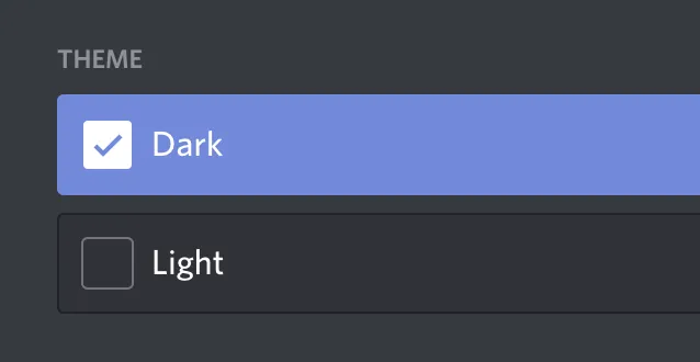
Shipping a macOS or iOS app nowadays without a setting to match the system appearance is an increasingly harmful accessibility oversight. Discord on macOS is one of the offenders that has been consistently annoying me since earlier this summer.

Nikita Prokopov sharing his experience using a free and open-source alternative to Dropbox called Syncthing.
Syncthing is everything I used to love about computers. It’s amazing how great computer products can be when they don’t need to deal with corporate bullshit, don’t have to promote a brand or to sell its users. Frankly, I almost ceased to believe it’s still possible. But it is.
It is indeed heartwarming to see products like these still exist—and bonus points for being made in Sweden under a non-profit! I gave up on Dropbox long ago, and I have the same iCloud issues Nikita outlined. I am very happy to jump ship after reading this glowing review.
A SwiftUI function grapher in 160 LOC. The framework might be immature, but it made a lot of my work a tad easier. I will share the source as part of a project I am currently working on, so stay tuned!

I find it extremely frustrating to get a YouTube video as an answer to a programming question. I watch videos when I want to leisurely learn about something new, but when I have a specific problem to solve, they are my very last resort.
As days keep getting longer here in Stockholm, I’ve been relying on the light appearance of macOS to avoid straining my eyes. One thing that caught me off guard is the dearth of decent-looking light themes for text-based applications. It’s almost as if developers have an overwhelming penchant for dark interfaces…
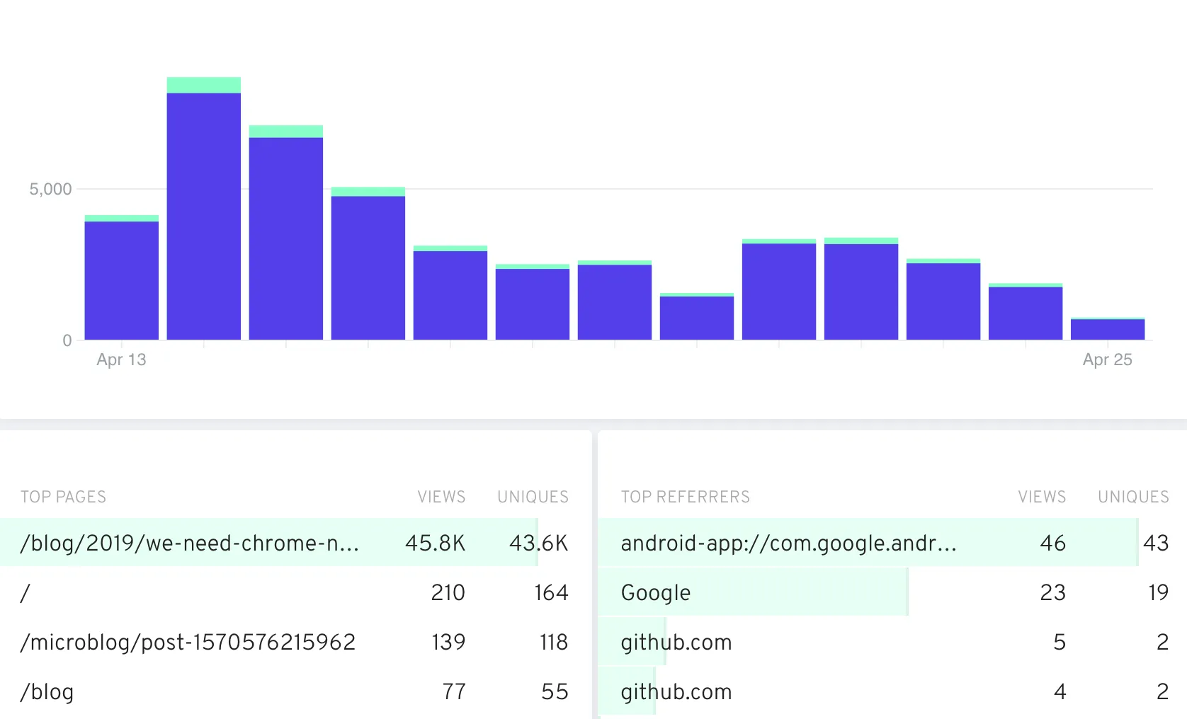
This month I noticed a sudden influx of visitors to the We Need Chrome No More piece form last year—46k page views is way, way above the monthly average hovering around 1k. My self-hosted instance of Fathom shows some limited data about top referrers, but none of the numbers make sense, and I am totally fine with that.
I’m genuinely excited to see Chris Krycho adopt the format I’ve been recently experimenting with on this microblog. I’ve learnt a lot from reading Chris’ essays and journal entries (also where I got the assumed audience idea from.), and I am looking forward to reading more of these.
Dear GitHub,
Where is my official dark mode support at? My eyes would profusely thank you for it. And they will be joined by many, many others in doing that.
Sincerely,
While browsing Product Hunt yesterday, I couldn’t help but get a strong mid-90s, GeoCities-esque, vibe as I scrolled past the animated GIF thumbnails.
I get it. This is how the attention economy works, and the Internet loves them GIFs. But when everything is screaming for your attention at the same time, the whole thing becomes a kitschy, obnoxious mess.
My good friend Mikael Muszynski sent me this nugget about metasyntactic variables:
I was reminded of the fact that companies which speak primarily in Swedish have their own metasyntactic variables!
The code will generally be written in English, but instead of
fooandbar, they have a clever system:“Apa” is the word for monkey in Swedish, and not only is it a somewhat amusing word, it also happens to start with the letter “a”!
So the pattern goes
apa,bepa,cepa,depa…
Clever indeed.
You know those placeholder words used when writing tests or documentation for software programs? They are called metasyntactic variables, and today I picked up some brand new ones beside the usual foo, bar, baz, and qux: corge, grault, garply, waldo, fred, plugh, xyzzy, and thud (source). The last one is definitely a keeper.
struct Thud: Thuddable { ... }I remember the first time I was introduced to toto—the most used metasyntatcic variable in French programming literature—and made fun of how silly and immature it sounded; a shortsighted take in retrospect.
Today was officially my first day as an indie. Even though the timing might be less than ideal, I can’t help but feel excited about it—especially whenever I take a gander at my meeting-free calendar.
I have drafted some plans leading to this, but I didn’t have a global pandemic in any of them. Silly me.
Then again, a quarantine is exactly what I need to start chiseling away at one or two behemoth projects that have been staring me down for the better part of last year.
Wish me luck. And f☆ck COVID-19.
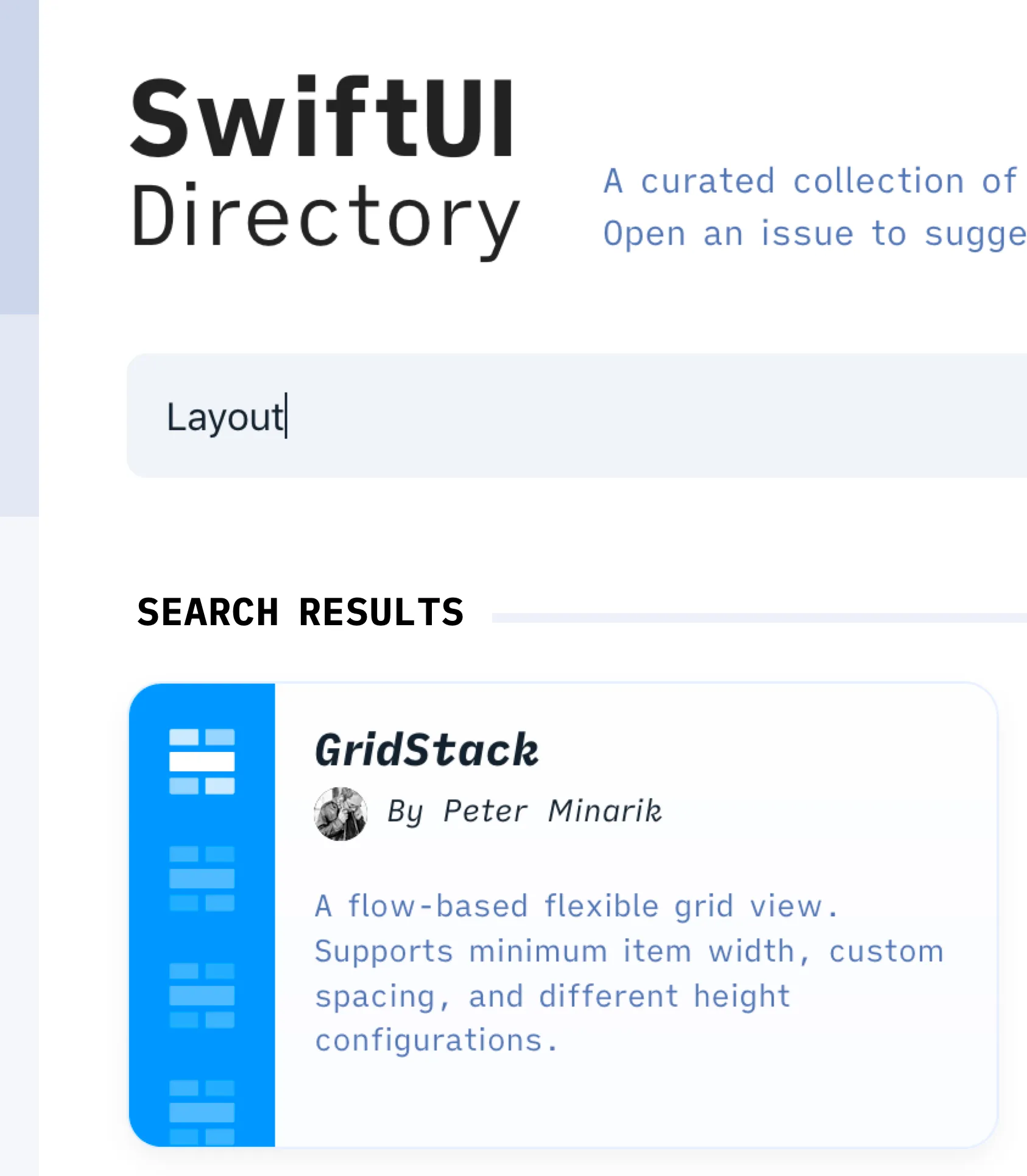
I am slowly starting to appreciate the versatility of the CSS Grid layout
module. For instance, in this
commit
I replaced a flex grid that required finicky media queries and margin
gymnastics with essentially three lines of code using grid. Here is a
variable-free version of what I ended up with:
display: grid;
grid-template-columns: repeat(auto-fill, minmax(20rem, 1fr));
grid-gap: 1rem;
The result can be seen here. Not only this achieves
the exact same result as my previous flex solution, but it is cleaner and
doesn’t use any media queries. Sign me up!
There is a new trend emerging in the design Dribbble community. And some
creative souls decided to call it neumorphism.
I have absolutely no qualms with visual experimentation, depth in user interfaces, or the specific effects used in this new trend. But I can’t help but feel put off by this incessant, collective infatuation with fads in UI design circles. It’s not healthy for anyone caught up in it, especially newcomers who have yet to find their creative footing.
If you are just starting out as a UI designer, learn to ignore design trends. You can thank me later.
Alexey Naumov in Performance Battle: AnyView vs Group:
I cannot say there is a clear leader among
AnyViewandConditionalView, but the myth about negativeAnyViewperformance implication is BUSTED.
I take most of what I see on Twitter with a grain of salt, especially when it’s technical advice that’s not backed by examples or reproducible benchmarks. In the case of SwiftUI, there is no shortage of guesswork and hearsay given how under-documented the framework is. And while I appreciate the openness, the occasional tweet from members of the core team is not enough to fill the knowledge gap.
Luckily, there is always an industrious soul in the community that rises up to the task of winnowing the chaff from the grains.
I absolutely love the work that the SSWG has been doing, and this annual update published by Tanner is a testament to this.
The lack of consensus on how to write server-side Swift has been dividing its fledgling community; something that the SSWG has been working towards solving since its inception.
I am hoping to be able to contribute more to this ecosystem, and I urge anyone who’s interested in making Swift more ubiquitous to do the same.
As a developer, there are days when I feel fortunate to work with bleeding edge technology. It’s empowering, eye-opening, and above all, fun.
Then there are days when I feel like I’m wasting a chunk of my life working with broken, undocumented, and unfinished tools that work against me at every turn.
I’ve come to accept that living with this ebb and flow is an integral part of professional life in this field. But sometimes I can’t help but wonder if we can do without the high mental and emotional toll that comes with this churn.
Sneak peek of something I’ve been working on this past couple of weeks.
Some of my impressions from the Apple Event from last Tuesday:
- The intro video was fun to watch, for once.
- Tim skipped the numbers update this time around. Good riddance.
- Apple Arcade is at least 4 years late. I’ll bite, regardless.
- Apple TV+ is cheaper than I, and many others, had expected.
- While I got used to the notch, I could get used to not having it. Too bad it’s here to stay another year, at least.
- Hats off for showing the name of the photographers and artists when showcasing photos and videos.
- “It’s so pro.”
- Save for the Watch’s always-on feature, the event didn’t quite live up to its title, “By Innovation Only.”
By default, git fetch gets an updated list of remote branches from the remote
and sets up remote branch references locally. However, it doesn’t delete stale
references that no longer have a counterpart on the remote. Trying to get rid of
these using the git push -f origin:branch-name command will fail with a
remote ref does not exist error.
To delete stale remote references, you need to pass the --prune option to
fetch like so:
git fetch --prune
- [deleted] (none) -> origin/branch-nameIf we were to represent the hierarchy of our refactoring itches as a pyramid, eliminating duplication would be at the very bottom. The DRY principle, as it is often referred to, is the uncontested cornerstone of good development practices.
SwiftUI, as new and unpolished as it is, already exposes some powerful APIs for that end. We’ve been using view extensions, view modifiers, and preference keys on a constantly growing codebase at work. If you’re looking to learn more about these largely undocumented capabilities, look no further than these two fresh posts:
@kaishin onPreferenceChange() did not change 😉 It always required Equatable (how would it detect changes otherwise!). What did change though, is that Anchor<Value> no longer conforms to Equatable 😕
--- The SwiftUI Lab (@SwiftUILab) August 3, 2019
I previously assumed that onPreferenceChange(_:perform:) added the Equatable
requirement, but it turns out that Anchor<Value> dropped its Equatable
conformance instead, as pointed out by
@SwiftUILab and the official
documentation.
A curious change, regardless.
I haven’t seen this mentioned anywhere, but the
onPreferenceChange(_:perform:) view instance method now requires the
preference key value type to conform to Equatabale as of Beta 5.
In practice, this means that oPreferenceChange can no longer be used with
preference keys that have an Anchor<Value> as their value type or a as a
property of their value type, since Anchor itself doesn’t conform to
Equatable. I fixed this by passing the GeometryProxy instance to a custom
view modifier that unpacks the anchor first using the provided proxy, then
passes the result as a CGFloat instead.
For more on preference keys and anchors check out this informative blog post series.
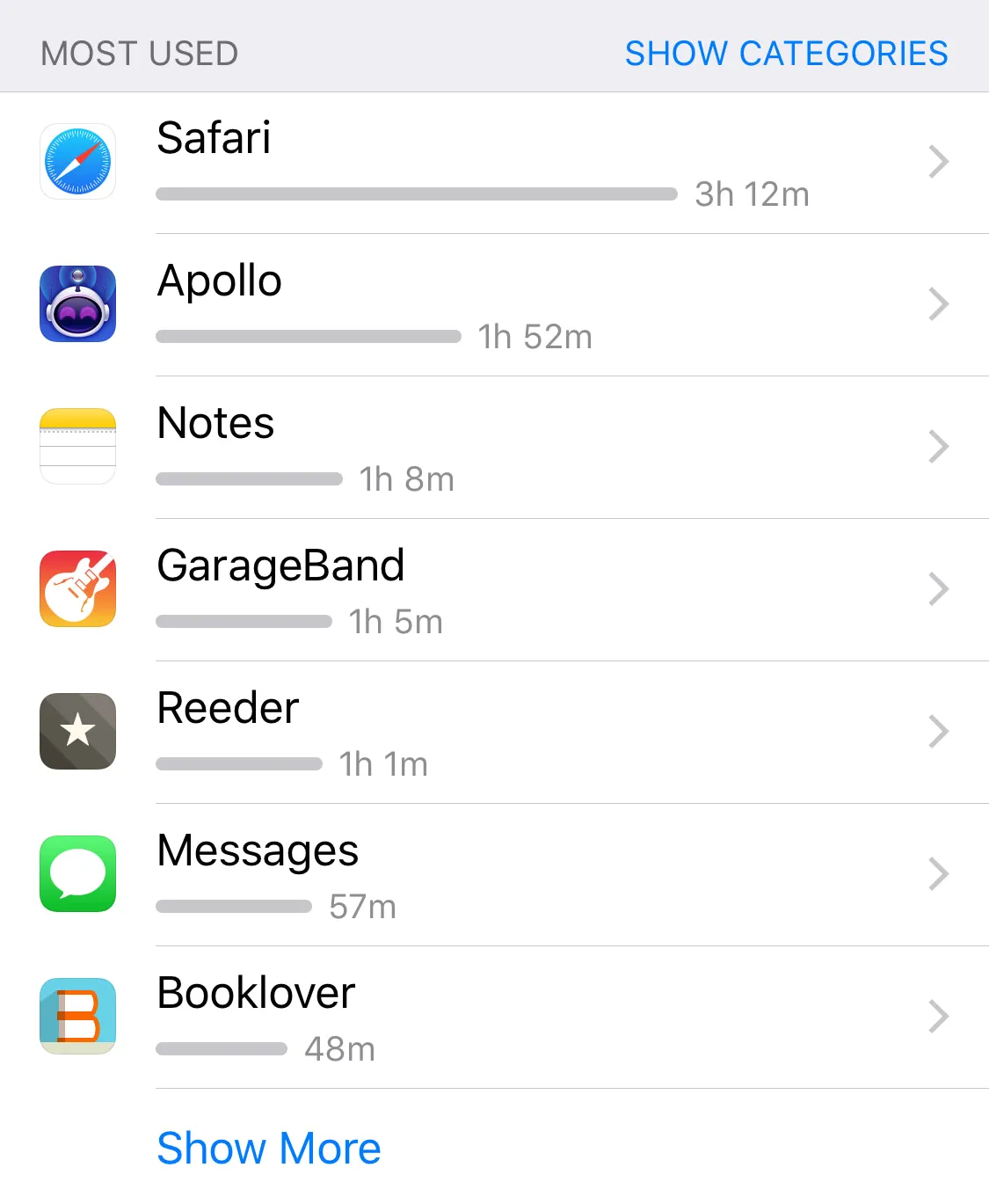
My Screen Time breakdown for last week. The time I used to spend on Twitter and Mastodon has shifted to reading, writing, and---ahem---browsing Reddit.
Not long ago, I started toying with the idea of rolling out a custom-built microblog instead of relying on third party platforms. Today, I am happy to launch a modest first iteration.
I will keep my single-user Mastodon instance and Twitter for the time being, but I will use them mainly to syndicate posts that will be published here first.


