Twitter iOS Apps: Interaction Design Showdown
This post has been archived. Some or all of the information below may no longer be relevant or correct.
In the thick of the controversy surrounding Twitter’s new third party restrictions, Tweetbot---the long-awaited Twitter client from Tapbots---is finally out for iPhone and iPod Touch. The overwhelmingly positive feedback is a clear sign that the app met and even exceeded expectations.
To find out whether Tweetbot is a legitimate contender, I decided to pit it against the official client using a GOMS-inspired, oversimplified human information processing model on a set of tasks performed by the average user on Twitter.
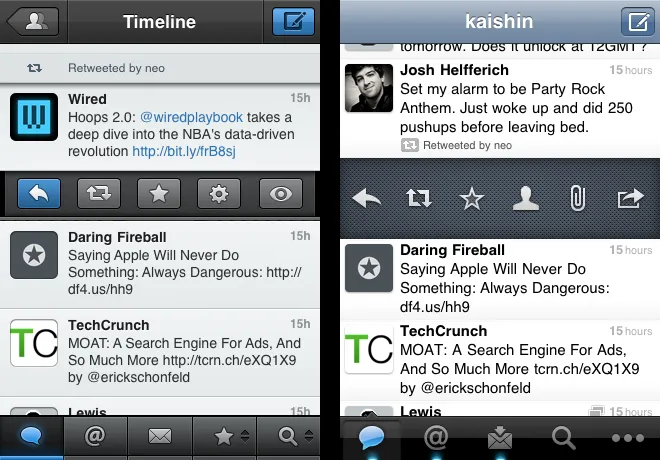
 Tweet options displayed after a single
tap.
The Rules
Before starting this exercise, let’s go over some of the concepts that will be used throughout the article:
-
An interaction is any point of contact between the user and the interface, such as a tap or a swipe. Each interaction is assigned a value based on the time required to execute it. For the sake of simplicity, a single tap is given a nominal value of
1and used as a base unit for other interactions. -
A task is any set of actions sharing the same end goal. There may be one or more set of interactions to carry out the same task. The time required to achieve a given task is considered to be equal to the sum of the individual values of each interaction involved. The lower the sum, the more efficient the interface.
-
Unless stated otherwise, typing time was zeroed out.
-
When two or more methods of achieving a given task are possible, only the most efficient one is used in the comparison. The impact on the overall workflow is also taken into account.
-
Only the default behavior of the triple tap is taken into consideration for Tweetbot.
The values assigned to each interaction are as follows:
| Interaction | Value |
|---|---|
| Tap | 1 |
| Double tap | 1.5 |
| Swipe | 1.5 |
| Triple tap | 2 |
| Long tap | 2 |
Thinking time was assigned a value of 0.5, and will be referred to as MOP
(multi-option prompt) in the tests. To keep things simple, the number of options
was not taken into account, nor was the habit factor.
Round 1: Basic Tasks
We’ll start by having a look at how efficiently the two clients handle basic tasks such as tweeting and replying:
| Task | Tweetbot | |
|---|---|---|
| Send a Tweet¹ | 2 | 2 |
| Reply¹ ² | 3 | 4 |
| Retweet (native) | 4 | 4.5 |
| Send a new DM³ | 6.5 | 5.5 |
| Open a link | 1.5 | 2 |
- No hashtags or @ signs.
- No other users mentioned in the original tweet
- The tap to get to the Messages view is zeroed out
Outcome: draw.
The two clients are equally efficient when it comes to tweeting and retweeting. Tweetbot cleverly handles single replies and links thanks to double and triple taps, while the official client makes sending a new direct message significantly less cumbersome.
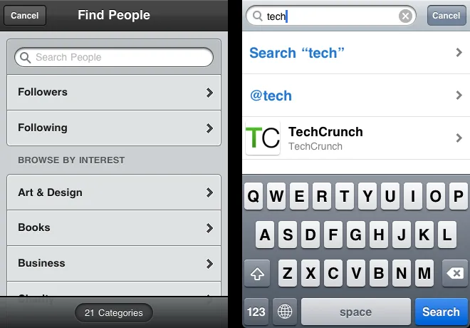
 Sending a direct message.
Round 2: Hashtags, Mentions, and Group Replies
Let’s now spice up the comparison with some hashtags and @ mentions:
| Task | Tweetbot | |
|---|---|---|
| Compose a tweet with # and @ | 7 | 4 |
| Compose a tweet with 3 # and 2 @ | 15 | 7 |
| View conversations¹ | 1.5 | 2 |
| Reply all (MMT)² | 4.5 | 5 |
| Reply single (MMT)² | 4.5 | 4 |
- Where the user takes part
- Multi-mention tweet
Outcome: Twitter for iPhone wins.
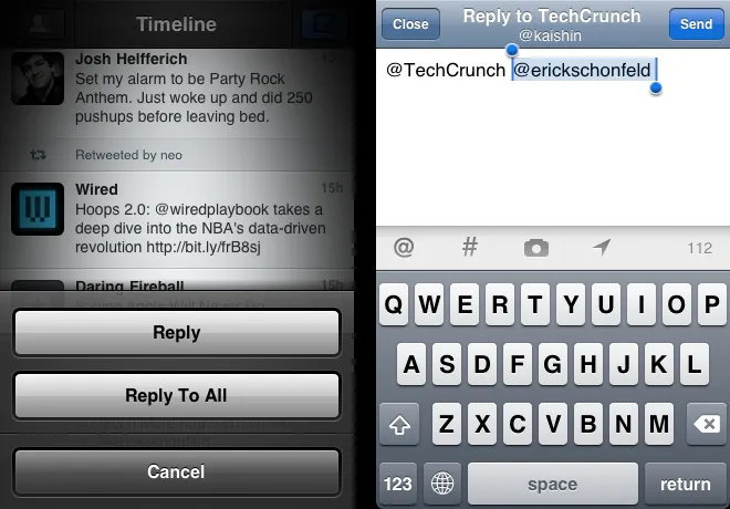
Thanks to shortcuts, the official Twitter client outclasses Tweetbot when it comes to composing tweets containing hashtags and @ symbols. In theory, the two clients handle multi-mention replies with almost equal efficiency. In practice, Twitter’s less intrusive solution gives it the upper hand.
 Replying a tweet with multiple @ mentions.
Round 3: User Actions & Lists
Now for the less frequent tasks:
| Task | Tweetbot | |
|---|---|---|
| Follow / Unfollow | 3.5 | 5 |
| Report a user | 5 | 8 |
| Translate a tweet | 4.5 | 5 |
| Favorite a tweet | 2.5 | 3 |
| Delete a tweet | 3.5 | 4 |
| Switch time-lines | 2.5 | 3 |
Outcome: Tweetbot wins.
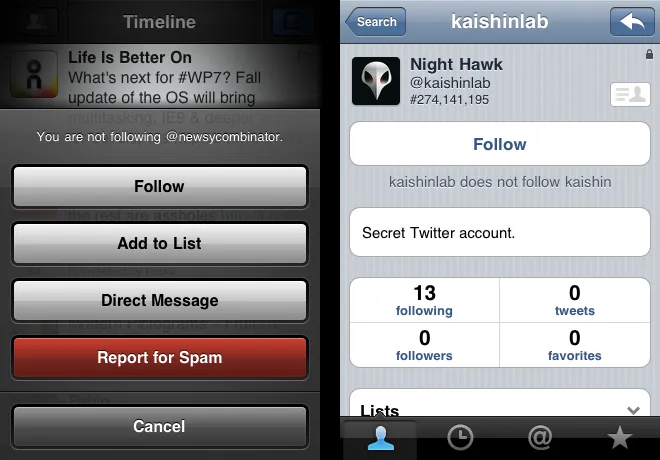
The official client didn’t stand a chance here; Tweetbot’s long tap is a godsend.
 Following a user.
Results
| Task | Tweetbot | |
|---|---|---|
| Total | 71 | 68 |
The relatively awkward, albeit native, method of keying hashtags and @ mentions in Tweetbot skews the results in favor of Twitter for iPhone. If it wasn’t for this detail, the third party client would have come out ahead.
When all is said and done, it would be short-sighted to pick a winner based on the total score alone. In order to gauge the relevance of these tests, we need to take a closer look at the way we use Twitter in reality. Studies suggest that a big majority of users on the social platform are silent; unless you are a news agency, a celebrity, or a spam bot, you are more likely to be reading tweets than tweeting or sending DM’s. As a result, the overall experience is greatly affected by our passive use, a point that the tests above completely eschewed in favor of purely active use scenarios.
Notably, Tweetbot shines in some areas that would be hard to assess using the HIP model above. Save for the occasional tweet, reply, or DM, we spend most of the time on Twitter wading through hundreds of tweets and swapping accounts and lists. Few Twitter clients address these areas as elegantly as Tweetbot does:
-
The number of new tweets (since the last refresh) is displayed in a unobtrusive blue bar in the timeline. This may seem gimmicky at first, but it turns out to be a huge time saver for timeline completionists.
-
Single swiping a tweet displays related tweets in a dedicated conversation view, even if the user is not taking part in them. There seems to be no way to do that in the official client.
-
Even though the visual style may not appeal to everyone, it provides a good balance of contrast between content and chrome.
For a 1.0 release, Tweetbot is doing a remarkable job, especially when considering the saturated and volatile market of Twitter third party clients. Even though there is still room for improvement in certain areas, Tweetbot for iPhone has got what it takes to dethrone the official client, and then some.
In round 2, we will introduce Twitterrific to the mix and revisit some of the tests introduced above.
